They can be found in every restaurant, in different forms; the menu. Some restaurateurs are very creative to make their menu as clear and striking as possible, other restorers do not. Where do you as a restorer really have to pay attention when designing a menu?
Important Restaurant menu design tips
In this 3-minute article, we share some crucial tips when designing your restaurant menu.

The restaurant menu design
Design the menu so that it fits exactly with the wishes of your target group. Avoid making the menu exactly as you want it to be. It may just be that your wishes are completely different from those of your guests. Guests do not buy on the basis of all technical data but on the basis of emotion. Communicate the origin of the products and tell something about the history of your restaurant. Tell your story and respond to the guest’s emotions.
Readability and contrast
A menu must be legible. Some menu cards have a busy image or a bright color as a background. This makes the text on the menu very difficult to read. The same applies to contrast; make sure that the background color and text color are complementary to each other so that readability is good. A grey text on a black background is a no-go.
Structure of the menu
Ensure that the structure of the menu is clear and structured. Put the dishes in different categories (starter, main course etc.) and ensure consistency in structure and design. Have a guest think about your menu card before you print a series or have the menu tested by your guest. The guest often has no knowledge of catering and scans a menu card design in a very different way than you might expect.
Avoid stress for the customer
The content of the menu is of course important. It is advisable to keep the range of dishes limited so that guests keep an overview and do not end up in a situation where there is too much choice (overkill!!). There is a rule of thumb to prevent choice stress, namely; 6 starters, 10 main courses and 6 desserts, less is also possible, more we recommend!
Psychology: it’s all-in-the-mind
Many studies have been conducted regarding the places on a menu where a dish sells the best. These studies show that the upper and lower dishes sell better. So put the dishes with a lot of margin on the top and bottom spots of the categories on your menu.
Quality of the card
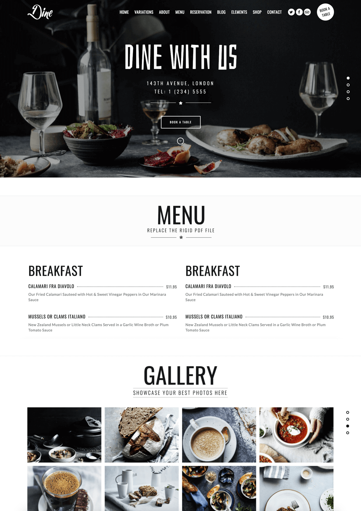
Dirty stains, fingerprints, worn corners and scratches on the menu. They are irregularities that occur regularly. Do not forget that your guest is in his hands for a long time with the menu card and looks at it ‘thoroughly’. Unlike your waiters and waitresses, they only share the menu and sometimes forget to check the quality of the menu. A well-groomed, professional menu says a lot about (the rest of) your restaurant. Tip: Because many people look in advance on the website of your catering facility, it is wise to place a digital version of your menu on your website. The guest then knows exactly what he/she can expect! This can be done as a PDF, even better it is to include the texts on the site itself.
Need inspiration? FML Marketing has an extensive collection of menu designs in all shapes and sizes! Contact us and we share our expertise, designs, and tips with you!
- Are you having trouble to establish a website for your restaurant in Estepona or Marbella? Contact us today. We can help you build an SEO-optimized website. a website that is easy to maintain yourself, completely in line with your branding, style, and image.


